
FINAL EVALUATION
When receiving the theme of Treasure, no ideas came to me. I decided to just wait and let the ideas come to me. This worked wonderfully for my idea ‘Atlantis’.
I had to come up with 5 proposals for game ideas around the word ‘Treasure’. I had one week to come up with these. The game idea that got chosen just came to my head. I feel like this is the best way to come up with good game ideas. I did not want to rush it and have 5 average ideas instead of 2 really good ones and 3 mediocre ones.
Before starting my research, I already had 2 Pinterest boards for the game idea: Atlantis. I had one for Underwater Ruins and one for Futuristic Structures. I really liked this idea of having two different environments in a game that contrast each other. These environments use two similar colour schemes yet they will give two completely different moods.
I did these Pinterest boards before I handed the 5 proposals in. I really wanted my tutors to pick my game idea ‘Atlantis’ because I had all the ideas in my head and I was really happy to start the project and actually go through with that pitch.
Halfway through my initial research, I found a book (New York 2140) that was exactly like my game but it wasn’t as futuristic. It was set 13 years before mine but it had the same circumstances. New York City has been submerged due to sea level rise. This book really helped me with what the conditions would be like and how people would have lived.
The book helped me understand the situation my game would be in and it helped me empathise with what someone in my game would feel. I didn’t get to read the book but I based my research of the blurb and a sample page. If I was to get more time on this project or restart it I would buy the book, read it and document my thoughts about it on my blog.
I think all this research actually helped me with doing my project. I used all of the visual research in my building and creature design. In previous assignments, I hardly looked at my visual reference which is why I didn’t get as good of a grade as I should have got. I think I have the ideas in my head but I just can’t put them on to paper. Using my visual reference was a big step up for me. I actually feel like it helped me with creating my ideas for my game. I was not stuck on what it would look like or what colours it would be. If there was one thing I wish I did more was noting down my ideas that were in my head instead of forgetting half of them.
I also annotated my research later on in the project which was a really bad thing to do. The annotation was meant to be a place where I can put down my ideas of what I wanted to do but I didn’t until after I did it. I feel like if I just annotated my work as I did it I would have a clearer image of what I would do the next day.
Halfway through the project, our class had a special speaker in who was from a TV Productions company. He helped me figure out a storyline for my game which helped me work out more of my game and how to plan it all out. Overall, this helped me understand more about my game and made it easier to design more aspects of my game since there was a motive behind it.
If I am ever to do another game concept I will be making a story to go with the game to help me throughout the project.
When I started to get on to the drawing stage of my work I didn’t really have a direction that I wanted to take. I didn’t have any true inspiration to draw so I just waited till I did. After a couple days, I made a few buildings sketches at home and that sparked my brain with ideas.
My sketches weren’t really that good but they showed what I was trying to do very clearly. I think this is what really matters when creating a game concept.
The main problem I have is I don’t like my own drawings. Therefore, I heavily relied on staff and peer feedback. Whenever I draw multiple versions of an asset I get peer feedback on which one they like the best and why. I also factor in my own opinion in. If there was one thing I wish I did more was get staff opinions because it is great to get opinions from other peers but an expert opinion is always great to get from staff. I am very happy that I moulded my work around feedback, I feel like this has really helped me develop my project further than just my own work.
If I was to do this project again I would always get peer and staff feedback on every piece of my work.
One problem I came about in my game was actually linking it back to treasure. I didn’t want to do the original treasures like in most fiction: old books, statues, gold or silver. I wanted my game to be unique and have a twist from other games. At first, after talking with staff, I came up with the idea of having modern day items as the treasure like computers, hard drives, cameras and just 21st technology in a whole. I started to draw some of these as little sketches but an idea came to my head. This idea was having knowledge of past life as the treasure for the future. Almost like a time capsule. I will still have old hard drives and cameras to collect for additional lore. I thought this was quite a unique idea. I can drive the story in any way I like and drift it off from actual history if I wanted to.
If I had more time to develop my story for my game I would plan this all out and have an intriguing storyline with twist and turns everywhere. I would want the audience to be on the edge of their seats all the way throughout the game.
With having knowledge as the treasure, it was easy to go along with the work I was doing. I didn’t have to really worry much about the treasure itself and instead I could work on the buildings and the creatures more.
Personally, I think having knowledge as the treasure is an easy way to think about the word ‘Treasure’ but I wanted my game to be unique and different from anyone else’s. In the end, I got to interpret the word ‘Treasure’ however I wanted and I chose the best way to support me with doing this project.
About 6 weeks into the project I had my final outcome idea thought of. I was going to do a promotional poster for my game to advertise. Having these ideas in my head, my work flow just stopped. Anything I was previously doing was stopped and I started on poster ideas, where the poster could go, what would it look like. At this point my work started to fall apart and I lost my motive to continue. I had just skipped a big part of my work because I had ideas in my head for the final project. I wanted to get the ideas down before I forgot them but halfway through I stopped and went back to my previous work because most of it wasn’t either finished or not fully annotated.
When it came to the last week of the project I just then started my final outcome. I didn’t really prepare well for making it. I hardly had any images to go into it with. Previous to starting my final outcome, I didn’t have any digital work beforehand so I was at a disadvantage from only starting my digital work now. If I was to do this project again I would have changed the way I did my work and started digital work a lot sooner rather than only for the final project.
For my final outcome, I didn’t get to do exactly what I wanted to do because I was limited with time.
I didn’t get to finish my poster because I left the digital aspect of my work till the end. I left out half of my creatures and buildings because I didn’t get the time to make them all. If I did do this my final outcome would be a lot better and a lot cleaner. I am very proud of how I did the perspective on the building with the water. I think that turned out really well. One thing I didn’t like very well was the underwater building. I could have added smashed glass and make the building more broken down instead of it looking like it was placed there.
Overall, I think this project went really well. I did what I was set out to do and made a poster for a game I thought of. I might not have done what I did exactly wanted but I did develop my work and hand rendering skills throughout this project which is what I was not so good at before I started this project but now that it is done I can look back at it and see my progression with my work and possibly continue with some pieces further for my digital portfolio.
Sky Development
ABOVE IS A SLIDESHOW OF 5 IMAGES
I had a lot of trouble with making my sky look more like a sky and not just blending the sea with the sky. My peer suggested cartoon like clouds but then they just looked out of place. This is when I got the idea of adding gaussian blur to the cloud to make them more fluffy.

Finished clouds.
Me and my peers think the clouds to the left work the best for my theme. They are more realistic than the clouds that my peer did for me. The gaussian blur really helps with the messy brush strokes and makes them less of the focus and more of an asset.
These clouds still look a little out of place from the rest of my final outcome. I could make them with the pen tool like I did with everything else but the gaussian blur makes it less noticable.
Typeface Development

I am experimenting with my typeface more after having a talk with my tutor about my typefaces and suggested messing around with warping the text in Illustrator. With doing this, I can make the text have a watery effect to keep to the theme of my work: Atlantis.
Digital Development 2
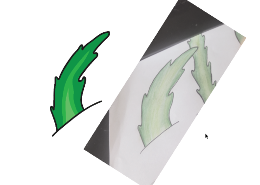
I took a picture of my hand rendered work and then placed it on my Illustrator document. After that I turned the image into a template which made it so I can trace over it.
Then, after I got the shape right, I smoothed the edges to give it a more smoother look instead of it being separate brush strokes. This made the vector more cartoon looking and more suitable for my target audience. I then did the darkest green the outside like the drawing and slowly started to make it lighter the closer in it gets. This look instead of using a gradient gives my style quite a unique look but still keeping the cartoon look.
I wanted my work to have a more realistic look but with the time restrictions I had on this project I don’t think I would have been able to do that.

Reflective Post: 11th of May 2017
Today in lesson I did further development into moving my drawings from freehand to digital. I made my three solar crystal designs on Illustrator and added a blue outer glow to them to show them working. I will be using these on my final outcome.
Possible Fonts for Poster
I want to use a few fonts on my poster which are easy to read and catch your eye.

Corals
This font is very clean and formal. It is easy to read and noticeable from a quick glance. It is a little thin but I think I can use this for information or the title.

Calm Waters
I think this would work well for my title or my body test. It is easy to read and it suits the theme of Atlantis. This is most likely going to be my chosen title text. I will discuss these with my peers though.

Atlantis Cruise
This text is really good. It’s bold but easy to read. I can imagine this text being as body text at the bottom of my poster.

Thickedy Quick
This typeface I can imagine it being the date release of the game.
I will make a mock up at home where I can download the fonts of what I want the poster to look like.
Digital Development
All of my work has been on paper. All my drawings, mark makings, ideas. I now am going to
